FFI International Group

FFI International Group
"Realeconomik Leadership"

NO EXCUSES - GET IT DONE

Featured post

#BIG #PLAYERS SEE #OIL AT $200 By 2022-End

  OILPRICE.COM Top Oil Traders See Oil Topping $200 By End-2022 By  Irina Slav  - Mar 24, 2022, A number of big oil traders now predict crud...

Search This Blog

Tuesday 29 December 2015

Energy 2050 #Oilmageddon Looms- Economy Terminally ILL (Part 4)

Energy 2050 Oilmageddon Looms


World Energy to 2050
 Forty Years of Decline
  
Our Energy Sources
Part 4
By Paul Cherfurka

Coal


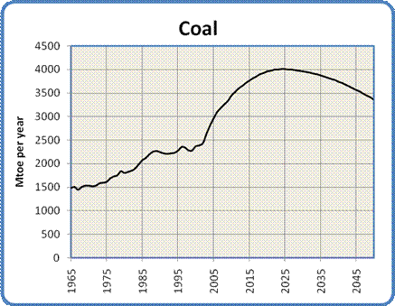
Coal is the ugly stepsister of fossil fuels. It has a terrible environmental reputation, going back to its first widespread use in Britain in the 1700s. London's coal-fired "peasoup" fogs were notorious, and damaged the health of hundreds of thousands of people. Nowadays the concern is less about soot and ash than about the acid rain, mercury and especially carbon dioxide that results from burning coal. For the same amount of energy released, coal produces more CO2 than either oil or gas. From an energy production standpoint coal has the advantage of very great abundance. Of course that very abundance is a huge negative when considered from the perspective of global warming.


Most coal today is used to generate electricity. As economies grow, so does their demand for electricity.  The need to use electricity to replace some of the energy lost due to the decline of oil and natural gas will put yet more upward pressure on the demand for coal. At the moment China is installing two to three new coal-fired power plants per week, and has plans to continue at that pace for at least the next decade.

Just as we saw with oil and gas, coal will exhibit an energy peak and decline, though for different reasons. One important factor in the eventual decline of the energy obtained from burning coal is that we have in the past concentrated on finding and using the highest grade of coal: anthracite. Much of what remains consists of lower grade bituminous and lignite. These grades of coal produce less energy when burned, and require the mining of ever more coal to get the same amount of energy.

In addition to their exemplary study of oil supplies mentioned above, the Energy Watch Group has also conducted an extensive analysis of coal use over the next century.  I have adopted their "best case" conclusions for this model. The model projects a continued rise in the use of coal to a peak in 2025. As global warming begins to have serious effects there will be mounting pressure to reduce coal use.  

Unfortunately, due to its abundance and our need to replace some of the energy lost from the depletion of oil and gas, the decline in coal use will not be as dramatic as seen with those fossil fuels. The model has coal use decreasing evenly from its peak to a production level similar to what it is today, giving the curve shown in Figure 5.


Figure 5: Global Coal Production, 1965 to 2050

Of course the increased use of coal carries with it the threat of increased global warming due to the continued production of CO2. Many hopeful words have been written about the possibility of alleviating that worry by implementing Carbon Capture and Storage. CCS usually involves the capture and compression of CO2 from power plant exhaust, which is then pumped into played-out gas fields for long term storage. This technology is still in the experimental stage, and there is much skepticism surrounding the security and economics of storing such enormous quantities of CO2 in porous rock strata.

Hydro


If coal is the ugly stepsister, hydro is one of the fairy godmothers of the energy story. Environmentally speaking it's relatively clean, if perhaps not quite as clean as once thought. It has the ability to supply large amounts of electricity quite consistently. The technology is well understood, universally available and not too technically demanding (at least compared to nuclear power). Dams and generators last a long time.


It has its share of problems, though they tend to be quite localized. Destruction of habitat due to flooding, the release of CO2 and methane from flooded vegetation, and the disruption of river flows are the primary issues. In terms of further development the main obstacle is that in many places the best hydro sites are already being used. Nevertheless, it is an attractive energy source.


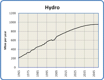
Figure 6: Global Hydro Production, 1965 to 2050

Development will probably continue in the immediate future at a similar pace as in the past.  The model for hydro power has its capacity increasing by almost 40% by 2050. This projected growth is gradually constrained toward the middle of the century by two main factors: most useful river sites are already in use, and water flows will gradually be reduced due to global warming.  There may also be a general loss of global industrial capacity (and/or rising development costs) due to oil and gas depletion.  Nevertheless, the pressure on hydro power to replace energy lost from oil and gas depletion will support continued development even in the face of such constraint.


Nuclear


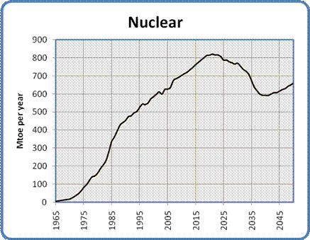
The graph in Figure 7 is a mix of data synthesis with a bit of projection. I started with a table of reactor ages from the IAEA (reprinted in a presentation to the Association for the Study of Peak Oil and Gas), the table of historical nuclear power production from the BP Statistical Review of World Energy 2007 and a table from the Uranium Information Centre showing the number of reactors that are installed, under construction, planned or proposed worldwide. 

The interesting thing about the table of reactor ages is that it shows the vast majority of the world's operating reactors (361 out of 439 or 82% to be precise) are between 17 and 40 years old. The number of reactors at each age varies of course, but the average number of reactors in each year is about 17. The number actually goes over 30 in a couple of years.


Two realizations formed the basis for my model of nuclear power. The first was that reactors have a finite lifespan averaging around 40 years, which means that a lot of the world's reactors are rapidly approaching the end of their useful life. The second realization was that the construction rate of new reactors and their average capacity can be inferred from the UIC planning table.We can therefore calculate the approximate world generating capacity with reasonable accuracy out to 2030 or so.

The model takes a generous interpretation of the available data. It assumes we will build all the reactors shown in the UIC data referenced above: six plants per year for the next five years, nine plants per year for the subsequent ten years, and ten plants per year until 2050. The model further assumes that all reactors will be granted life extensions to 50 years from their current 40, and that no plants will be prematurely decommissioned.  It also assumes that each plant generates an average output equivalent to 1.53 Mtoe per year. The derivation of this figure is given in the model data available here.


Figure 7: Global Nuclear Production, 1965 to 2100

The drop in output between 2020 and 2037 is the result of new construction not keeping pace with the decommissioning of old reactors. The argument for a peak and subsequent decline in nuclear capacity is very similar to the logistical considerations behind Peak Oil - the big pool of reactors we currently use will start to become exhausted, and we're not building quite enough replacements.  The rise after 2037 comes from my estimate that we will then be building 10 reactors per year compared to 6 per year today. The net outcome is that in 2050 nuclear power will be supplying about the same amount of energy that it is today.

A number of factors may act to increase that output.  Those changes could include the uprating of existing reactors to produce more power than their original design specification, an increase in the size of future reactors and/or a building boom prompted by concerns about global warming and the decline of oil and gas supplies.

Restraining the increase will be economic factors (construction will become more expensive as oil and gas deplete, driving up the cost of materials and transportation), and continuing public opposition to nuclear power plants, waste storage and uranium mining.  At some point uranium mining itself may also become a bottleneck - the current world production of about 50,000 tonnes of uranium per year could need to increase to around 70,000 tonnes per year in order to fuel the increased number of reactors.  Of course the amount of additional uranium required will depend entirely on the number of new plants that actually get built.


A number of advanced reactor technologies are presently under investigation or development, including high energy "fast reactors" that produce less waste, reactors that can use more abundant and cheaper thorium as a fuel, and "pebble bed" designs that promise improved safety.  None of these technologies are commercially available (and are unlikely to be within the next decade or two), so they have not been incorporated into the model.


Next
Part 5: Renewable Energy


Friday 27 November 2015

Energy 2050 #Oilmageddon Looms- Economy Terminally ILL (Part 3)

Energy 2050 Oilmageddon Looms


World Energy to 2050 
Forty Years of Decline

Our Energy Sources
Part 3

By Paul Cherfurka

Our Energy Sources

Oil


The analysis of our oil supply starts from the recognition that it is finite, non-renewable, and subject to effects which will result in a declining production rate in the near future. This situation is popularly known as Peak Oil. The key concept of Peak Oil is that after we have extracted about half the total amount of oil in place the rate of extraction will reach a peak and then begin an irreversible decline.

This peak and decline happens both for individual oil fields and for larger regions like countries, but for different reasons. In individual oil fields the phenomenon is caused by geological factors inherent to the structure of the oil reservoir. At the national or global level it is caused by logistical factors. When we start producing oil from a region, we usually find and develop the biggest, most accessible oil fields first. As they go into decline and we try to replace the lost production, the available new fields tend to be smaller with lower production rates that don't compensate for the decline of the large fields they are replacing.

Oil fields follow a size distribution consisting of a very few large fields and a great many smaller ones. This distribution is illustrated by the fact that 60% of the world's oil supply is extracted from only 1% of the world's active oil fields. As one of these very large fields plays out it can require the development of hundreds of small fields to replace its production.

The theory behind Peak Oil is widely available on the Internet, and some introductory references are given herehere and here.  In addition, the German organization Energy Watch Group provides an exceptionally comprehensive (but still accessible) overview of the topic in the Executive Summary of their recently released study of Peak Oil.


Timing


There is much debate over when we should expect global oil production to peak and what the subsequent rate of decline might be. While the rate of decline is still hotly contested, the timing of the peak has become less controversial. Recently a number of very well informed people have declared that the peak has arrived. This brave band includes such people as billionaire investor T. Boone Pickens, energy investment banker Matthew Simmons (author of the book "Twilight in the Desert" that deconstructs the state of the Saudi Arabian oil reserves), retired geologist Ken Deffeyes (a colleague of Peak Oil legend M. King Hubbert) and Dr. Samsam Bakhtiari (a former senior scientist with the National Iranian Oil Company).  This view is also supported by the extremely detailed analysis published by the Energy Watch Group mentioned above.

My position is in agreement with these luminaries: the peak is happening as I write these words (in late 2007). I have confirmed its occurrence to my own satisfaction by examining the pattern of oil production and oil prices over the last three years. I discovered in the process that crude oil production peaked in May 2005 and has shown no growth since then despite a doubling in price and a dramatic surge in exploration activity.

Decline Rate


The post-peak decline rate is another question. The best guides we have are the performances of oil fields and countries that are known to be already in decline. Unfortunately, those decline rates vary all over the map. The United States, for instance, has been in decline since 1970 and has lost 40% of its production capacity since then, for a decline rate of about 2% per year. On the other hand, the North Sea basin is showing an annual decline around 10%, and the giant Cantarell field in Mexico is losing production at rates approaching 20% per year.

In order to create a realistic decline model for the world's oil, I have chosen to follow the approach of the Energy Watch Group, which is similar in profile to the projections of Dr. Bakhtiari in his WOCAP model . Both assume a gradually increasing decline rate over time, starting off very gently and ramping up as the years go by. The main difference is that the EWG model is slightly less aggressive than WOCAP. WOCAP predicts that production will fall from its current value of 4000 million tonnes of oil per year (Mtoe/yr) to 2750 Mtoe/yr in 2020, while the EWG projects a decline to 2900 Mtoe/yr by then.  The EWG projects an oil supply of just under 2000 Mtoe in 2030.  My model projects a decline rate increasing from 1% per year in 2010 to a constant rate of 5% per year after 2025, resulting in an average decline rate of 4% per year between now and 2050.  In 2050 oil production is only 18% of what it is today, as shown in Figure 1.


Figure 1: Global Oil Production, 1965 to 2050


Keep in mind that Peak Oil is primarily a transportation fuel problem.  Almost 70% of the world's oil is used in transportation as gasoline, diesel fuel, jet fuel and bunker fuel for ships.  Right now there is a lot of excitement surrounding the development of electric cars.  However, the immediacy of the peak and the slope of the following decline suggest that it may prove difficult to replace enough of the global automobile fleet in the time available to maintain the ubiquitous personal mobility we have become used to.  Europe and Asia are placing a lot of emphasis on electrifying inter-city rail and urban mass transit.  Rail electrification seems like a sensible initiative that should be pursued urgently by all nations.


Natural Gas


The supply situation with natural gas is very similar to that of oil. This similarity makes sense because oil and gas come from the same biological source and tend to be found in similar geological formations. Gas and oil wells are drilled using very similar equipment. The differences between oil and gas have everything to do with the fact that oil is a viscous liquid while natural gas is, well, a gas.

While oil and gas will both exhibit production peaks, the slope of the post-peak decline for gas will be significantly steeper due to its lower viscosity. To help understand why, imagine two identical balloons, one filled with water and the other with air. If you set them down and let go of their necks, the air-filled balloon will empty much faster than the one filled with water. Even though oil and gas reservoirs are made up of porous rock rather than being big pockets of liquid or gas, they behave in much the same way.Because of its viscosity, oil reservoirs often require their internal pressure to be raised over time by pumping in water, in order to force out the oil and maintain their flow rates. In contrast, when a gas reservoir is pierced by the well, the gas flows out rapidly under its own pressure. As the reservoir empties the flow can be kept relatively constant until the gas is gone, when the flow will suddenly stop.

Image result for oil exhaustion


Gas reservoirs show the same size distribution as oil reservoirs. As with oil, we found and drilled the big ones, in the most accessible locations, first. The reservoirs that are coming on-line now are getting progressively smaller, requiring a larger number of wells to be drilled to recover the same volume of gas. For example, the number of gas wells drilled in Canada between 1998 and 2004 went up by 400% (from 4,000 wells in 1998 to 16,000 wells in 2004), while the annual production stayed constant. These considerations mean that the natural gas supply will exhibit a similar bell-shaped curve to what we saw for oil.  In fact, the production of natural gas peaked in the United States in 2001, and in Canada in 2002.  In addition, the remaining large gas and oil deposits are in less and less accessible locations, making the extraction of their reserves slower and more expensive.

One other difference between oil and gas is the nature of their global export markets. Compared to oil, the gas market is quite small due to the difficulty in transporting gases compared to liquids. While oil can be simply pumped into tankers and back out again, natural gas must first be liquefied (which takes substantial energy), transported in special tankers at low temperature and high pressure, then re-gasified at the destination which requires yet more energy. As a result most of the world's natural gas is shipped by pipeline, which pretty well limits gas to national and continental markets. This constraint has an important implication: if a continent's gas supply runs low it is very difficult to supplement it with gas from somewhere else that is still well-supplied.

The peak of world gas production may not occur until 2025, but two things are sure: we will have even less warning than we had for Peak Oil, and the subsequent decline rates may be shockingly high.  I have chosen 2025 as the global peak (20 years after Peak Oil).  The peak is followed by a rapid increase in decline to 10% per year by 2050, for an average decline rate of 6% per year. In 2050 gas production is projected to be only 24% of its current value.  The production curve for natural gas is shown in Figure 4.


Figure 4: Global Natural Gas Production, 1965 to 2050

One of the big concerns regarding a decrease in global natural gas supplies has to be about its role in the production of ammonia for fertilizer.  Currently 4% of the world's natural gas is used for fertilizer production (the largest uses are as industrial and residential heat sources, and for electricity generation).  As the gas supply declines the price will automatically rise and fertilizer prices will go along for the ride.  Rising fertilizer prices will have dire consequences in a world whose expanding population needs to be fed, where much of the land would not be able to sustain its current production levels without artificial fertilizer, and where the largest population increases will occur in the poorest nations with the least productive soils.


It is possible to produce the hydrogen required to make ammonia (the feedstock for most fertilizer) from other sources - coal and electrolysis are often mentioned.  There are substantial risks associated with those approaches, though.  The cost of hydrogen from alternative sources is still considerably higher than for hydrogen made from methane, pricing any resulting fertilizer out of the reach of those who need it most.  Making hydrogen from coal will also generate greenhouse gases as the carbon is burned for process heat.  Electrolysis depends on having cheap sources of surplus electricity available, electricity that is not being used for higher priorities.  As will become clear below, there is a strong posibility that such surpluses will never materialize, especially if the natural gas currently being used for electricity generation needs to be replaced by other sources.


Oil and Gas Combined


Oil and natural gas are the world's primary fuel sources, used for both transportation and heat.  Together they supply a full 60% of the energy currently used by humanity.  According to this model, their combined energy peak will come in 2012, at 6679 Mtoe.  By 2050 they will be producing a combined energy of only 1386 Mtoe.  This represents a drop of 80%.  To the extent that we cannot replace this shortfall through novel uses of electricity from other sources, this decline represents an enormous challenge.  It is a challenge that seems destined to alter the fundamental shape of our civilization over the next three or four decades.


Next

Part 4: Our Energy Sources (con't)


Wednesday 28 October 2015

Energy 2050 #Oilmageddon Looms- Economy Terminally ILL (Part 2)

Energy 2050 Oilmageddon Looms


World Energy to 2050 
Forty Years of Decline

Introduction
Part 2
By Paul Cherfurka

Preface


This article supercedes an earlier work, "World Energy and Population: Trends to 2100".  Compared to that paper this article offers a more comprehensive look at the world's evolving energy supply picture and confines its projections to the first half of the century.  Also unlike that earlier work, this article makes no assumptions about changes in human population due directly to reductions in the world's energy supply.  At the end of the article I will briefly examine one highly probable effect the decline in total energy would have on the quality of human life.

The analysis is intended to clarify a future energy supply scenario based purely on the situation as it now exists and the directions it shows obvious signs of taking.  The model is not intended to show the effects of any of the large-scale changes in direction that have been proposed to cope with declining oil and gas supplies or rising CO2 levels.  Solar or nuclear power "Manhattan Project" style efforts, for example, are not considered.  Treat this scenario as a cautionary tale: given the known resource constraints in energy, this is the likely outcome if we don't take collective action but rather just continue business as usual.

This article will not present any prescriptive measures for either supply or demand management.   You will not find any specific suggestions for what we ought to do, or any proposals based on the assumption that we can radically alter the behaviour of people or institutions over the short term. While the probability of such changes will increase if the global situation shifts dramatically, such considerations would introduce a level of uncertainty into the analysis that would make it conceptually intractable. The same constraint holds true for new technologies. You will not find any discussion of fusion or hydrogen power, for example.

Introduction

Throughout history, the expansion of human civilization has been supported by a steady growth in our use of high-quality exosomatic energy. This growth has been driven by our increasing population and our increasing level of activity.  As we learned to harness the energy sources around us we progressed from horse-drawn plows, hand forges and wood fires to our present level of mechanization with its wide variety of high-density energy sources.  As industrialization has progressed around the world, the amount of energy each one of us uses has also increased, with the global average per capita consumption of all forms of energy rising by 50% in the last 40 years alone.

This rosy vision of continuous growth has recently been challenged by the theory of "Peak Oil", which concludes that the amount of oil and natural gas being extracted from the earth will shortly start an irreversible decline.  As that decline progresses we will have to depend increasingly on other energy sources to power our civilization.  In this article I will offer a glimpse into that changed energy future.  I hope to be able to provide a realistic assessment of the evolution of the global energy supply picture, and to estimate how much of the various types of energy we will have available to us  in the coming decades.


Methodology

The analysis in this article is supported by a model of trends in energy production. The model is based on historical data of actual energy production, connected to projections drawn from the thinking of various expert energy analysts as well as my own interpretation of future directions and some purely mathematical projections.

The current global energy mix consists of oil (36%), natural gas (24%), coal (28%), nuclear (6%), hydro (6%) and renewable energy such as biomass, wind and solar (about 2%). Historical production in each category (except for renewable energy) has been taken from the BP Statistical Review of World Energy 2007. In order to permit comparison between categories I use a standard measure called the tonne of oil equivalent (toe). Using this measure, well-known conversion factors for thermal and electrical energy production permit the different energy sources to be easily compared.


We will first examine the energy sources separately, applying the development parameters that seem most appropriate to each. For each source I will define as clearly as possible the factors I have considered in building its scenario. This transparency will allow you to decide for yourself whether my assumptions seem plausible. We will then combine the individual energy analyses into a single global energy projection.

Notes

The model was developed as a simple Excel spreadsheet. The timing of some significant energy-related events and rates of increase or decrease of supply were chosen through careful study of the available literature. In some cases different authors had diverging opinions on these matters. To resolve those situations I have relied on my own analysis and judgment. As a result the model has remained open to the influence of my personal biases. I make no apology for this potential subjectivity; such scenarios always reflect the opinions of their authors, and it is best to be clear about that from the start. Nevertheless, I have made deliberate efforts throughout to be objective in my choices, to base my projections on observed trends in the present and recent past, and to refrain from wishful thinking at all times.

The Excel spreadsheet containing the data used in this model is available here.


Next
Part 3: Our Energy Sources  


Friday 25 September 2015

Energy 2050 #Oilmageddon Looms- Economy Terminally ILL (Part 1)

Energy 2050 Oilmageddon Looms


World Energy to 2050
 Forty Years of Decline

By Paul Cherfurka
http://www.paulchefurka.ca/


Climbing the Ladder of Awareness


When it comes to our understanding of the unfolding global crisis, each of us seems to fit somewhere along a continuum of awareness that can be roughly divided into five stages:
  1. Dead asleep. At this stage there seem to be no fundamental problems, just some shortcomings in human organization, behaviour and morality that can be fixed with the proper attention to rule-making. People at this stage tend to live their lives happily, with occasional outbursts of annoyance around election times or the quarterly corporate earnings seasons.
  2. Awareness of one fundamental problem. Whether it's Climate Change, overpopulation, Peak Oil, chemical pollution, oceanic over-fishing, biodiversity loss, corporatism, economic instability or sociopolitical injustice, one problem seems to engage the attention completely. People at this stage tend to become ardent activists for their chosen cause. They tend to be very vocal about their personal issue, and blind to any others.
  3. Awareness of many problems. As people let in more evidence from different domains, the awareness of complexity begins to grow.  At this point a person worries about the prioritization of problems in terms of their immediacy and degree of impact. People at this stage may become reluctant to acknowledge new problems - for example, someone who is committed to fighting for social justice and against climate change may not recognize the problem of resource depletion.  They may feel that the problem space is already complex enough, and the addition of any new concerns will only dilute the effort that needs to be focused on solving the "highest priority" problem.
  4. Awareness of the interconnections between the many problems. The realization that a solution in one domain may worsen a problem in another marks the beginning of large-scale system-level thinking. It also marks the transition from thinking of the situation in terms of a set of problems to thinking of it in terms of a predicament. At this point the possibility that there may not be a solution begins to raise its head.

    People who arrive at this stage tend to withdraw into tight circles of like-minded individuals in order to trade insights and deepen their understanding of what's going on. These circles are necessarily small, both because personal dialogue is essential for this depth of exploration, and because there just aren't very many people who have arrived at this level of understanding.
  5. Awareness that the predicament encompasses all aspects of life.  This includes everything we do, how we do it, our relationships with each other, as well as our treatment of the rest of the biosphere and the physical planet. With this realization, the floodgates open, and no problem is exempt from consideration or acceptance. The very concept of a "Solution" is seen through, and cast aside as a waste of effort.
For those who arrive at Stage 5 there is a real risk that depression will set in. After all, we've learned throughout our lives that our hope for tomorrow lies in  our ability to solve problems today.  When no amount of human cleverness appears able to solve our predicament the possibility of hope can vanish like a the light of a candle flame, to be replaced by the suffocating darkness of despair.

How people cope with despair is of course deeply personal, but it seems to me there are two general routes people take to reconcile themselves with the situation.  These are not mutually exclusive, and most of us will operate out of some mix of the two.  I identify them here as general tendencies, because people seem to be drawn more to one or the other.  I call them the outer path and the inner path.


However, the inner path does not imply a "retreat into religion". Most of the people I've met who have chosen an inner path have as little use for traditional religion as their counterparts on the outer path have for traditional politics.  Organized religion is usually seen as part of the predicament rather than a valid response to it. Those who have arrived at this point have no interest in hiding from or easing the painful truth, rather they wish to create a coherent personal context for it. Personal spirituality of one sort or another often works for this, but organized religion rarely does.


It's worth mentioning that there is also the possibility of a serious personal difficulty at this point.  If someone cannot choose an outer path for whatever reasons, and is also resistant to the idea of inner growth or spirituality as a response the the crisis of an entire planet, then they are truly in a bind. There are few other doorways out of this depth of despair.  If one remains stuck here for an extended period of time, life can begin to seem awfully bleak, and violence against either the world or oneself may begin begin to seem like a reasonable option.  Keep a watchful eye on your own progress, and if you encounter someone else who may be in this state, please offer them a supportive ear.

From my observations, each successive stage contains roughly a tenth of the number people as the one before it. So while perhaps 90% of humanity is in Stage 1, less than one person in ten thousand will be at Stage 5 (and none of them are likely to be politicians).  The number of those who have chosen the inner path in Stage 5 also seems to be an order of magnitude smaller than the number who are on the outer path.

I happen to have chosen an inner path as my response to a Stage 5 awareness. It works well for me, but navigating this imminent (transition, shift, metamorphosis - call it what you will), will require all of us - no matter what our chosen paths - to cooperate on making wise decisions in difficult times.

Best wishes for a long, exciting and fulfilling  journey.

Bodhi Paul Chefurka


Next:

Part 2 - Introduction 

Monday 14 September 2015

It Makes No Sense To Raise Fed Rates, & More News


Why The Fed Would Be Insane To Raise Rates: The Rising U.S. Dollar


The USD strengthening since last July is the core driver of the global recession.
The parlor game of the moment is laying odds on the Federal Reserve's decision to raise rates, leave rates unchanged, or (gasp!) hint at future stimulus. There are certainly a multitude of inputs to the Fed's decision, and a variety of potential consequences, but only one really matters: the effect on foreign exchange/currency markets.

It's not that difficult to understand the one dynamic that matters. If the Fed raise yields/interest rates in the U.S., that makes the U.S. currency, i.e. the U.S. dollar (USD), more attractive.
Higher yield = more attractive, especially when coupled with the liquid market for U.S. Treasuries and the relative safety of the dollar vis a vis other currencies issued by falling-into-recession nations and trading blocs.

Jim Simons was a mathematician and cryptographer who realized: the complex math he used to break codes could help explain patterns in the world of finance. Billions later, he’s working to support the next generation of math teachers and scholars. TED’s Chris Anderson sits down with Simons to talk about his extraordinary life in numbers.


The AP reports that some driver advocates like the Center for Auto Safety were concerned that this pledge doesn’t do enough to get automatic breaking systems into cars. Those advocates would rather the government legally require cars to have automatic breaking systems, instead of rely on a voluntary promise to keep drivers safe. Another concern is that automatic braking systems are generally sold as add-ons to luxury vehicles, which would put them out of reach of most consumers


Credit default swaps are contracts that let investors buy protection to hedge against the risk that corporate or sovereign debt issuers will not meet their payment obligations.
The market peaked at $58 trillion in 2007, according to the Bank for International Settlements, but shrank to $16 trillion seven years later as investors better understood its risks


One often wonders why governments indebt themselves for so much more than they can ever hope to pay… Here, Western economists, bankers, traders, Ivy League academics and professors, Nobel laureates and the mainstream media have a quick and monolithic reply: because all nations need “investment and investors” if they wish to build highways, power plants, schools, airports, hospitals, raise armies, service infrastructures and a long list of et ceteras, economic and national activities are all about.


This ranking sorts 61 countries by price, earnings needed to buy a gallon, and annual income spent on fuel.

BRASÍLIA — The president of Brazil should have been ecstatic. She had just won re-election after an intense campaign in which she fiercely defended her role in making Brazil, for a few fleeting years, a rising star on the global stage.
But in the days after her victory last October, President Dilma Rousseff was worried, confronted in private deliberations with her closest advisers by signs that Brazil’s triumphs were at risk of coming undone.
“We went too far,” Aloízio Mercadante, Ms. Rousseff’s chief of staff, acknowledged publicly this month, describing the sense of alarm as the dust settled after the election and Ms. Rousseff and her aides grappled with the weaknesses in Brazil’s economy.


A Passing Thought...


Most All-timePopular Posts

DREAM BIG, ACHIEVE SMART